Zeefleet
I designed and developed the website while working directly with Zeefleet's founder. My focus was turning a technical freight story into an experience that was easier to scan, understand, and act on.
View live siteZeefleet needed to explain a technical B2B offering clearly enough that prospective customers and partners could quickly understand what the company does, how the model works, and why it matters.
A responsive website built around clearer product storytelling, stronger hierarchy, and a simpler explanation of Zeefleet's zero-emission freight model.
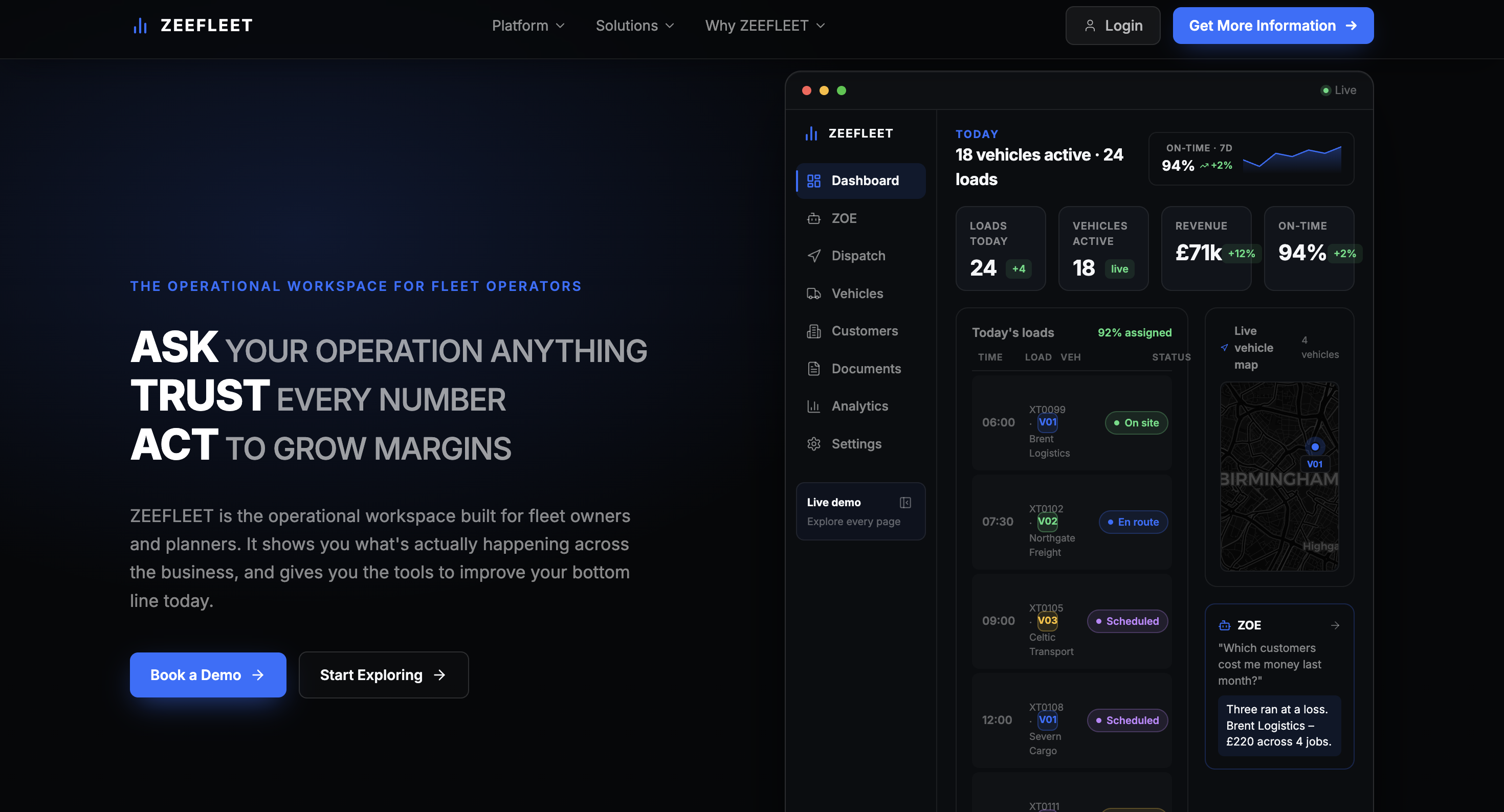
Starting with the Story, Not the Screens
Before designing screens, I needed to decide what the website had to communicate first. The founder's brief covered the product, freight operations, and the transition to zero-emission fleets. I used three questions to organize the story: What does Zeefleet do? How does it work? Why does it matter? Those questions became the hierarchy for the site and a filter for what deserved space on each page.
Why the First Direction Changed
My first direction used familiar SaaS feature grids. It was visually clean, but reviewing it with the founder showed that the layout broke the offering into isolated features instead of telling one connected freight story. I moved away from that structure, reduced the competing sections, and let the product, process, and operational narrative lead. The feedback changed the information architecture, not just the styling.
Turning the Brief into a Clear Hierarchy
I owned the web design and front-end implementation while the founder provided feedback and approvals. I grouped the content around the questions visitors needed answered, then used that hierarchy to decide what appeared early, what could be simplified, and where calls to action belonged. That kept reviews focused on whether the story made sense, not just whether a screen looked finished.
Using Wireframes to Test the Story Early
I used wireframes to test the content order before committing to visual polish. I focused on bringing the product forward earlier, reducing dense explanations, breaking the process into easier-to-scan steps, and placing calls to action where they followed naturally from the story. This let me change hierarchy quickly and gave the founder something concrete to react to before development began.
Lead with the product
Bring the platform and service model forward earlier so visitors understand the offer before they encounter supporting detail.
Reduce content density
Break technical explanations into clearer sections and scanning points instead of long blocks of copy.
Make the next step obvious
Place calls to action where they follow naturally from the story rather than treating them as isolated buttons.
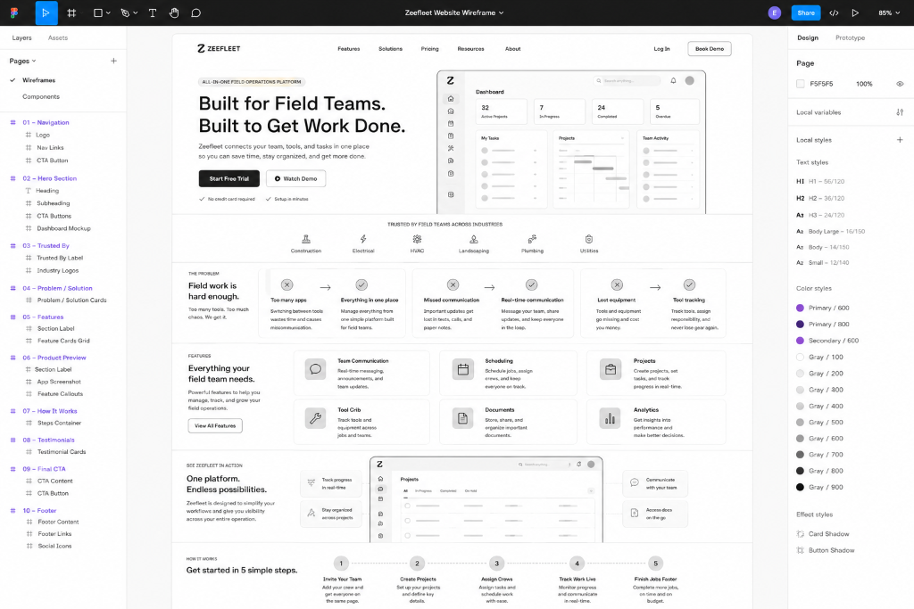 WIREFRAME // MID-FIDELITY
Designing Through the Build
Once the direction was approved, I carried the same hierarchy into the responsive front-end build rather than treating development as a handoff. I refined spacing, content density, calls to action, and responsive behavior as the pages came together. The visual system stays restrained so the product story can lead with clearer sections, simpler explanations, and a more direct path through what Zeefleet offers and how it works.
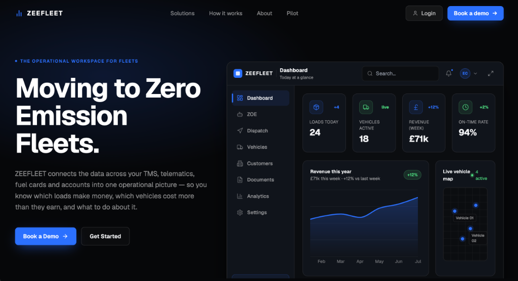
Hero — Moving to Zero Emission Fleets
What I Learned and What Comes Next
This project changed how I think about designing for technical products. The hardest part was not making the interface look simpler. It was deciding what information deserved attention and in what order. Working directly with the founder also pushed me to explain decisions in terms of clarity and business communication instead of personal preference. A finished build is not proof that every decision works, so my next step would be testing the hierarchy with prospective fleet customers and reviewing site behavior to see where people hesitate or need more context.